


Fold7 targets sweet-loving GenZ for Hi-Chews UK launch
Japanese candy brand makes UK debut with distinctive new brand voice and social campaign
Japanese fruit-flavoured sweet brand, HI-CHEW, makes its UK debut this week with a distinctive new brand world and social campaign created by Fold7. Targeting a sweet-loving, digitally native Gen Z audience, this is the first time the brand has used an agency to define its positioning and visual universe.
Founded in 1918, Hi-Chew’s parent Morinaga & Company, was the first modern confectionery company in Japan and is now the largest in Asia. Soft and chewy, highly fruity and long-lasting, HI-CHEW launched in the US ten years ago and has grown into a $90m brand. It hopes to recreate this success with its UK launch.
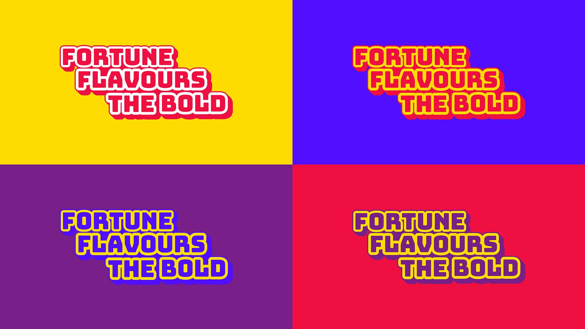
To create the brand’s visual language, the Fold7 team drew inspiration from Japanese TV graphics and street signage. Short, sharp and irreverent at times, punchy colour combinations bring the intense fruit flavours to the fore, resulting in a brand world that is highly distinctive and fun.
Expressive typography using Bungee, by David Jonathan Ross of The Font Bureau, which was originally created as a celebration of urban signage and shares the form of HI-CHEW, gives it a bold, confident, soft and stretchy look. The illustrations are constructed using the shape of the chew. Simple and blocky, it is highly versatile and can be used to create fruit, pattern elements, stickers and GIFs that can be organically shared across multiple digital platforms.
Fold7 Head of Design Jamie Craven said: “Bringing the Hi-Chew brand to life has been an absolute joy. With the help of a great client, we’ve been able to create a bold, bright and fun world for Hi-Chew – one that I think we’ve only just started to scratch the Fold7 team drew inspiration from Japanese TV graphics and street signage. Short, sharp and irreverent at times, punchy colour combinations bring the intense fruit flavours to the fore, resulting in a brand world that is highly distinctive and fun. the surface of. I’m very excited for it to finally be out in the world.
Rob McNeilly, Head of Europe at Morinaga, said: “Fold7 have done a great job of bringing the brand to life and we’ve quickly formed a trusting partnership with them. This is only the start of the plans we have for the next year, and there’s lots more to come as we build our awareness and distribution across the UK.”
Credits:
Client: HI-CHEW, Morinaga
Client: Rob McNeilly, Head of Europe; Kazuyuki Matsuda, Chief Marketing Manager – International
Agency: Fold7
CCO: Ryan Newey
Head of Design: Jamie Craven
Design and Art Direction: Alex Gill
Animation: Nick Smith
Copywriting: Alex Gill, Simon Helm, Verity Fine Hosken
Brand strategy: Caitlin Evans
Account Directors: Hazal Karabulut, Stuart Lundy